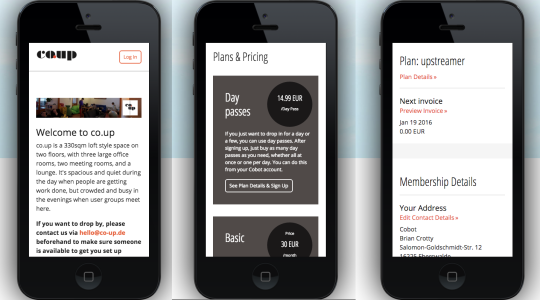
We at Cobot are always pushing the software forward to improve the experience for both our spaces and their members. Two weeks ago we made an announcement about the nine latest Cobot backend improvements, and hinting at something bigger to come. Today’s the day: we’d like to present you with our redesigned and mobile-friendly members’ section!
These regular improvements are all part of our commitment to giving you:

The details
Over the summer we gave our booking calendar a new design to make it mobile-ready and an improved user experience. This same methodology has now been applied to Cobot’s member section.
If you are a space on a regular plan, this will be rolled out for you on Friday, December 18th.
If you are still in trial or on a Pro plan, you will have a five days to customize and preview the design before it is published. On Wednesday, December 23rd, the new designs will be automatically published for all pro spaces as well.
To make customizations, follow these menus:
- Setup > Customization > Member’s Section
- Input all your color information and view them in a real-time preview
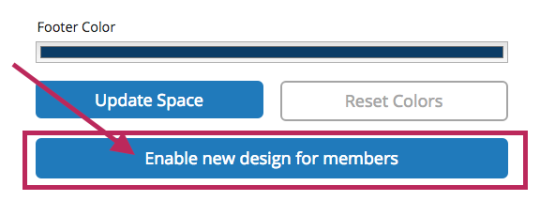
- As soon as you’re ready with your new color selections, a single click will enable the new design for your members.
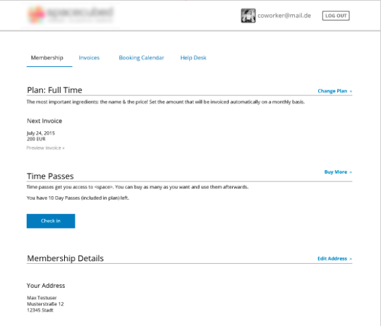
The new look
Open, simple, clean.
As always, if you have any feedback about the new design, we would love to hear your thoughts!
Onwards, upwards, and happy coworking!
Your Cobot team
