For more than five years, we’ve been working daily on Cobot’s development. Regular updates, new features, and improvements make Cobot a lean and easy to use management software, especially made for coworking spaces. Now our design will get a touch up, too. Hope you’re excited as we are!
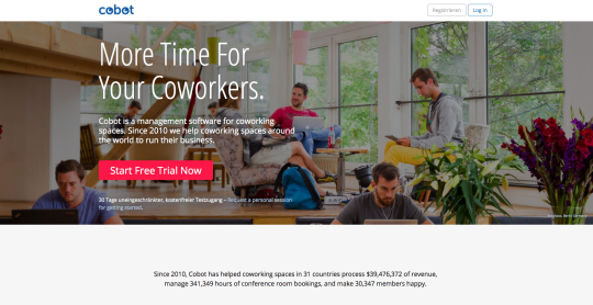
Maybe some of you already noticed the first changes on our homepage, which have already been up for a few days. We’ve updated the landing page and made it responsive for mobile requests, which means that opening Cobot on a smartphone or any tablet PC will keep a good, legible appearance in every size of the page. Besides that, new icons as well as fields in different colors will help structure the pages and guide readers to what’s important.
Steadily, with lots of heart and plenty of good ideas, our design team, Kriesse and Kida, will continue Cobot’s makeover over the coming weeks. The new design will be of course remain user-friendly: modern but also clear and accessible.
We hope you will like it. Let us know! Your feedback is welcome anytime.
Stay tuned for further updates!
Your Cobot team
